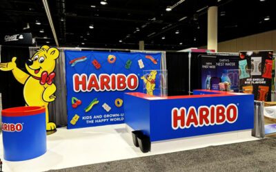
There are standard colors for every industry and every brand has its own marketing department-approved shades. But generally speaking, there are universally expected colors such as blues, grays, white and pops of red. These are safe and work just fine, but we like it when our clients go for something bolder because it shows guts and a personality that speaks to their target market.
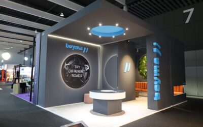
It’s important to note that bold doesn’t have to mean bright. At conventions like medical shows where industry expectations make neon colors an absolute risk, opting for accents that differ just enough from corporate-friendly shades can do the trick. A suggestion we’ve seen work nicely is to look for paints and laminates in rich and warm wood colors. That same palette has also worked well for clients who want to make metal products and machinery stand out.
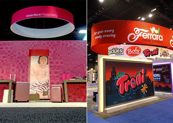
It goes without saying that bright colors aren’t for everyone and they wouldn’t be appropriate at every show. However, for the right company and the right expo, it can be the way to go. The above example shows Interface’s hospitality division doing something more drastic at HD Expo than some of their other divisions would do at other trade shows. It stands out but manages to still look professional and fresh, making a statement that was noticed by all attendees.
Ferrara’s design used color a bit differently. Because its graphics were already so vibrant for Sweets and Snacks Expo, the company’s brands were identified and reinforced by custom colored LED backlighting around the product displays. This solution successfully avoided overwhelming attendees while adding extra umph to the exhibit.
Quick tips for exhibit color design:
-Stay true to your brand.
-Know what “bold” means for each show and industry. Ask your team questions like: Would this still be considered professional? Will this stand out against or even clash with our competitors’ usual palette?
-Using patterns, textures or lighting can play up and add to your color choices.
-Keep in mind colors on the show floor you have no control over like aisle flooring.
There are endless ways to use colors in your exhibit’s design. Whether you want to stay safe or take a risk, use lighting or laminates, explore options that fit your brand and chosen shows with your designer and builder to find a surprisingly simple way to stand out.