The RSA Conference in San Francisco is one very loud show! There are lots of demos and theater presentations on the show floor with people blasting through the barriers of sound! So, it’s a loud and bright show with lots of distracted attendees everywhere.
With the size and volume of RSA, capturing eyes and ears is a serious challenge. Keeping that in mind, let’s take a look at what some of our favorite exhibitors did to bring attendees to their exhibits and keep them there.
Juniper
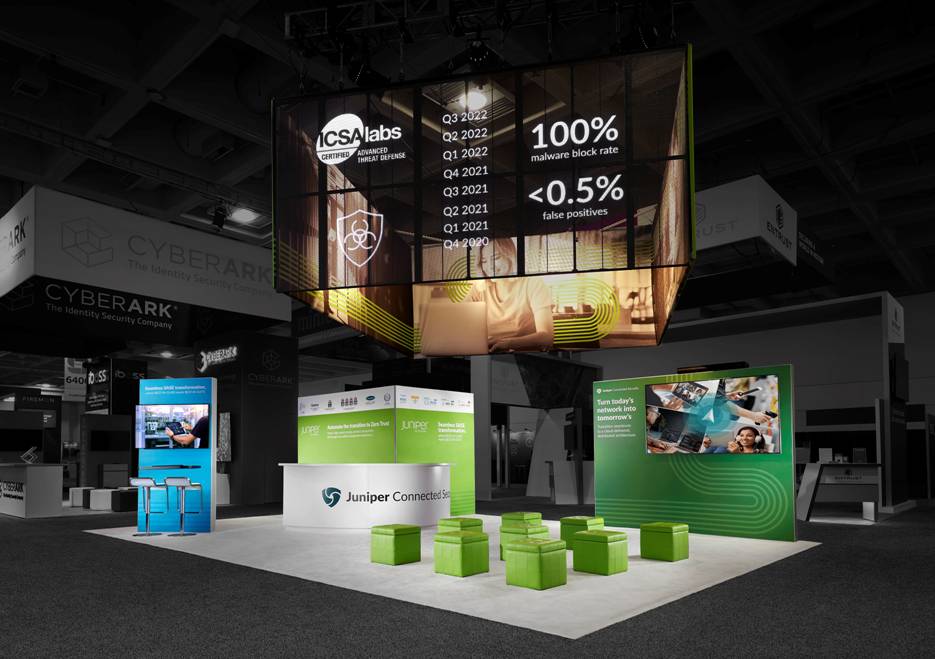
We had two clients on the RSA floor this year. Juniper had a wonderful presence in the front of the hall. Having a transparent LED high in the sky had a strong visual impact. The booth design took advantage of their location by angling the sign. It was pointed directly at the entrance on the right side so when people walked in, they are able to see their sign. Juniper’s graphic
designers do a great job of incorporating data that speaks to the exact prospect they are targeting. Taking advantage of the 3-second window to draw in the attendees they want.
BeyondTrust
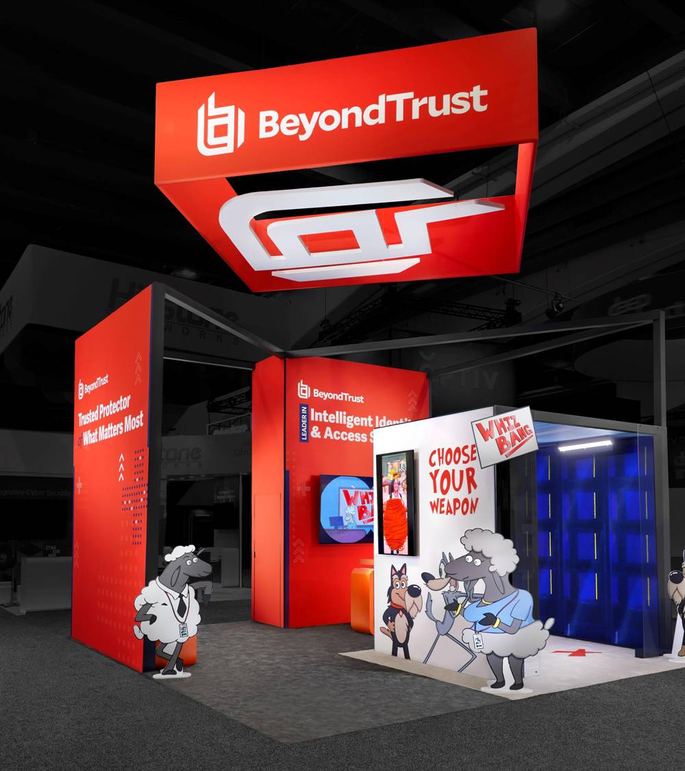
BeyondTrust’s booth really stood out with a bright orange color and a hanging sign that made them visible from far out. Their experiential piece consisted of a ‘choose your weapon’ series that we designed for them that was a big hit with visitors.
The experiential portion was unique on the show floor and brought the fun, with attendees required to answer questions to participate. The questions were designed to give the sales team the info needed to qualify an attendee. The questions covered things like where they are in the sales process, what their decision-making process looks like, how far out they are from making a decision, and what product they currently use. Plus a fun question about Monty Python and the Holy Grail! The answers went to the sales team for an easier and personalized follow up.
We like this experience which delivers qualified leads versus companies that are giving a prize but not getting anything out of it. BeyondTrust had around 150 attendees go through the process so clearly it did its job.
Illumio

A beautiful and bright booth with their bold orange brand color! We also liked the theater-style presentation area and the hanging sign with dimensional letters on the wall they created to give some privacy. They did a really good job with lighting and AV in general so easy to see at a distance. Their reception desk sort of got lost, but their staff was on their game by welcoming attendees and engaging immediately. One thing that stood out was their staff positioned along
the wall to speak to attendees and dive a little deeper into the next level of messaging.
CrowdStrike
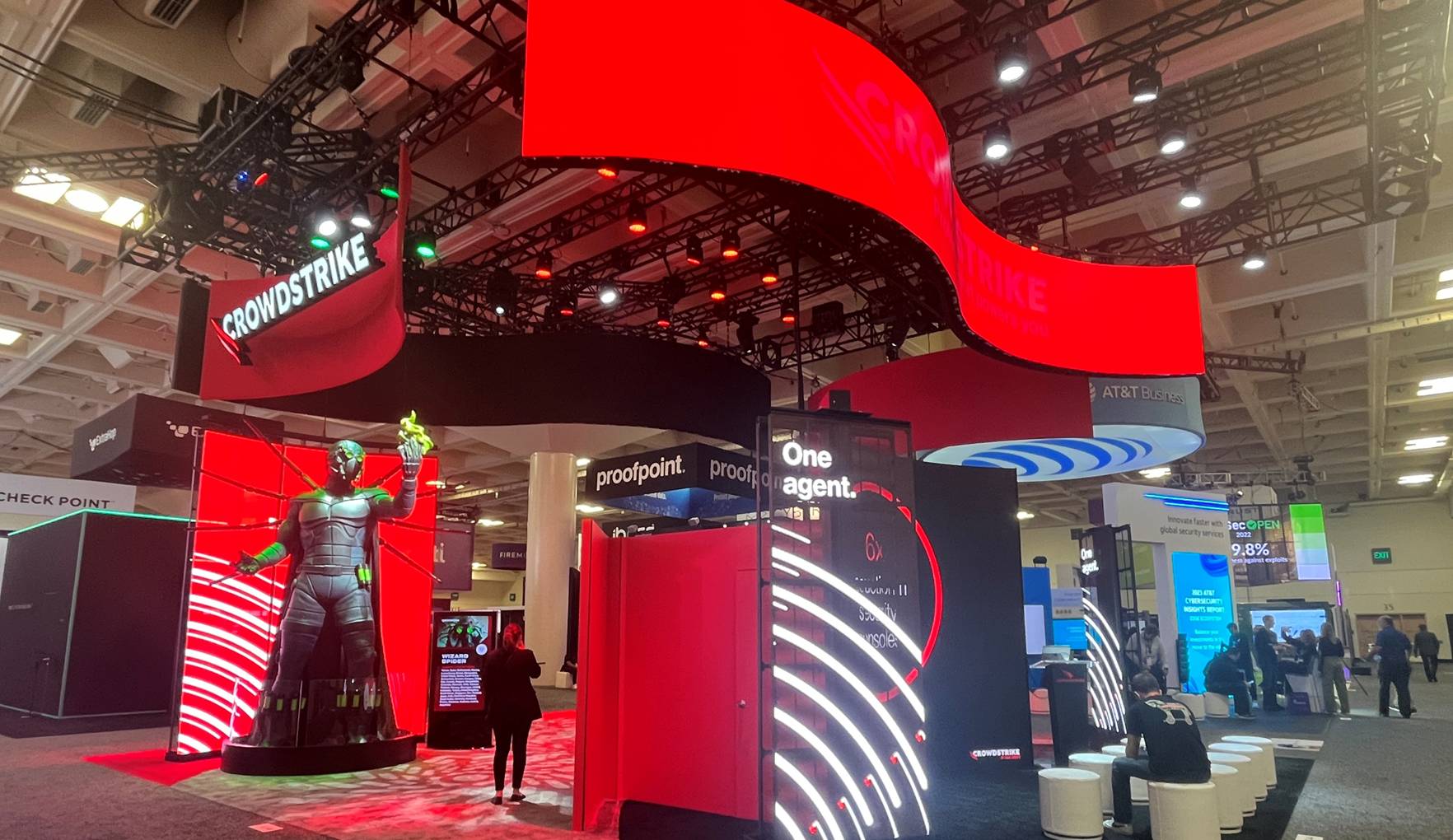
CrowdStrike was a big, huge crowd favorite! While this was a smaller footprint for them compared to BlackHat, they know how to exhibit and how to engage a crowd. There was a great presentation area with translucent LEDs on the left and right that were really beautiful with great content. RSAC had mascots were everywhere, which is show heaven for us. Those mascots represent the adversaries of your computer and inside they gave away toy-sized
packaged adversaries. They always have a good show and great talent in the booth. CrowdStrike is probably in the top 3 of the most highly-valued cybersecurity companies and they show it with their spend on the floor.
ExtraHop
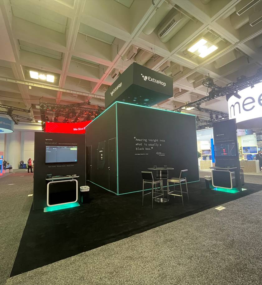
ExtraHop looked pretty basic from the outside looking in. What we loved was how they created a little mystery by providing an area where attendees were invited to come in and hack. But, you had to earn your way to go inside the box, which was a great way to draw people into the booth.
Securonix
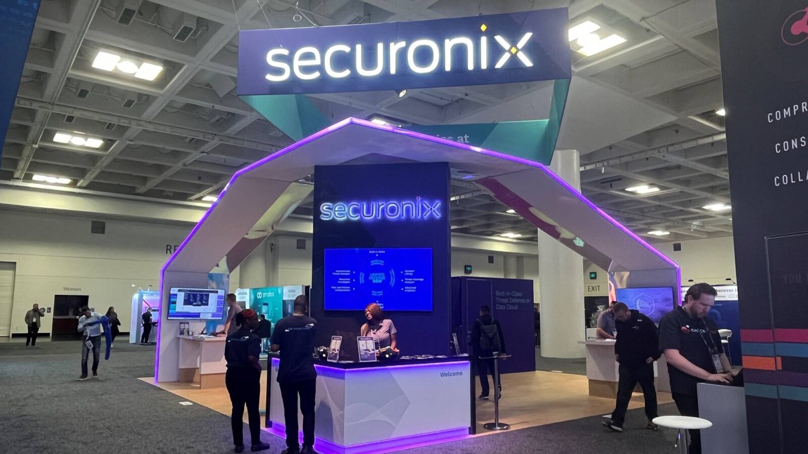
This was an excellent example of how to stand out when your position is less than ideal. We liked the overarching structures and the glow on the Securonix booth. That was a unique shape and profile that you don’t see at all and it commanded attention even though it was in the back of the hall.
We loved the lighting and purple color and that their reception desk covers both corners. Their staff was really engaged and they had some good demo stations and good flow in their space, which was not oversaturated. A big giveaway at this show was tiny little stickers; Securonix had plenty with their brand X on them.
One of the things you’ll see is that people have finally gotten the fact that positioning on the corner makes sense and helps with the flow of the booth.
VMware
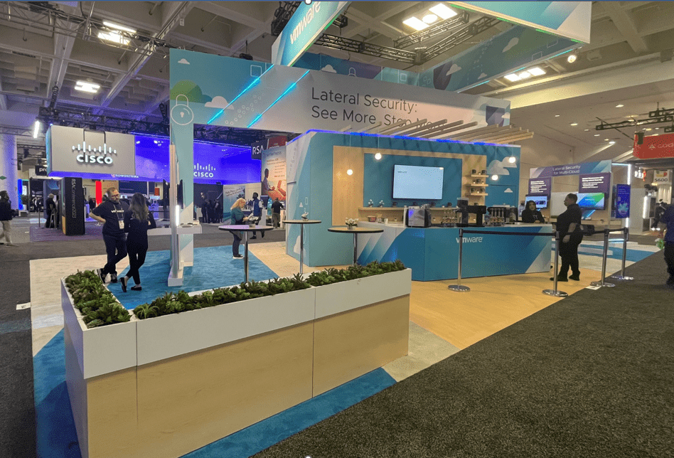
VMware had a nice open space with highways for conversations and, on the opposite side, a theater-style space for demos. Their staff was phenomenal; so good that one of their staffers travels with the booth because she is that good!
You’ll find tons of hired talent at cyber shows. Most presenters and a lot of the staff in booths are professional actors and we noticed the hired talent was incredible at pulling people off the aisles. Companies will pay for talent, something we saw frequently at RSA.
Deloitte
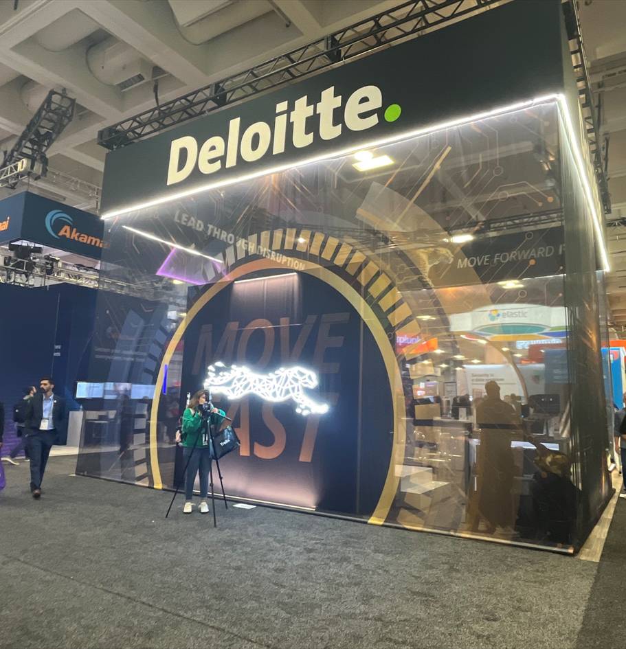
With a cheetah as your brand messaging, you’re going to attract attention! And that’s exactly what Deloitte did. They featured a hospitality area up front with a DJ in back engaging the crowd. Something unique was their use of sheer fabric that dropped from the bottom of their sign to the floor. That’s not an expensive technique, but it had a big impact and the added layer gave it a big look.
Varonis
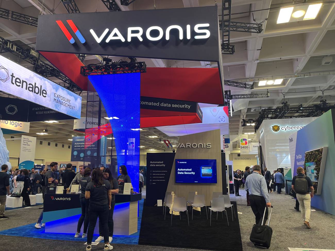
We liked their colors, the angle on the unique hanging sign, and their blue LED glow. They had a nice reception desk and incorporated warm tones through an integrated natural wood grain look on the structure as well as the flooring, with a simple demo area in the back.
Abnormal
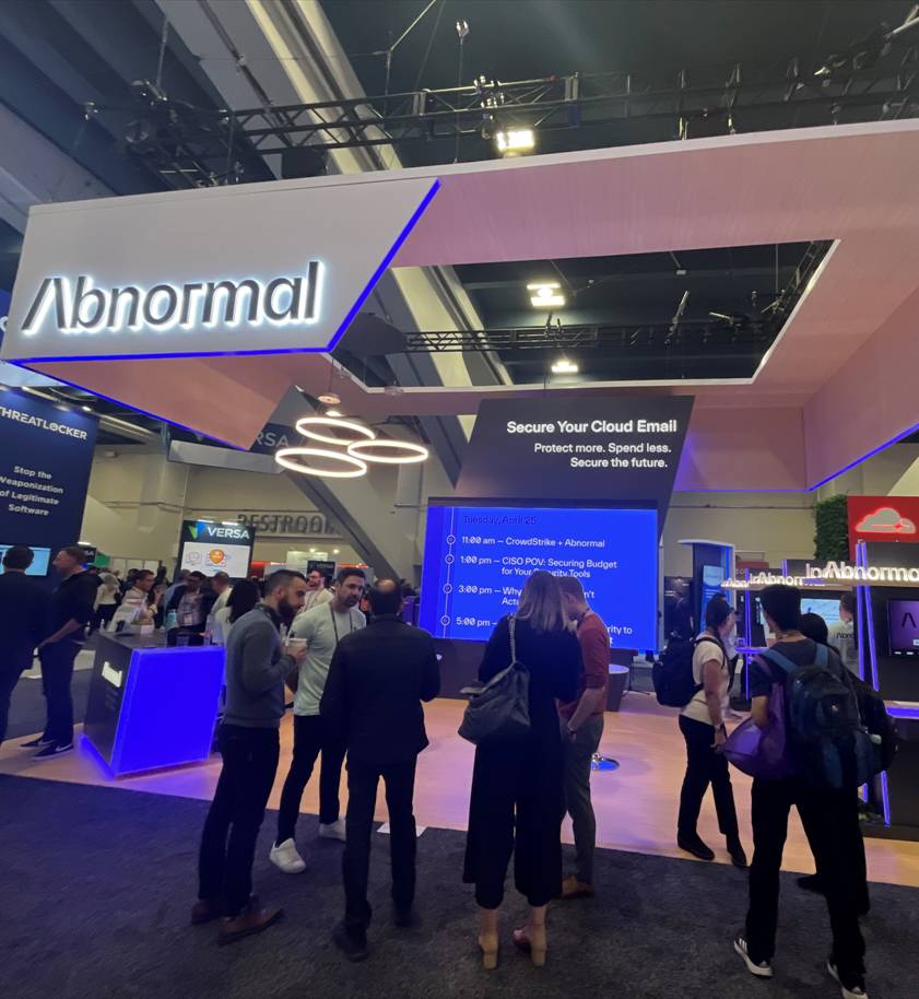
Abnormal did a really good job of pulling their branding through every element of their exhibit. A prime example of a company that, even if you removed all their branding, you’d still know this was Abnormal’s booth. From their hanging sign to the demo stations, everything took the A shape. Even their Whack-A-Nomaly game in the booth was branded! (Very sad that Jay missed the high score by one, but he still won a prize!) They also gave out a deck of cards with their personalized branding message on each card—beautiful but not cheap.
Next

We liked the use of wood grain visually integrated with their sign and the nice touch of a pendant drop lamp. You really got a feeling of comfort with the lamps and the wood grain. We also liked their colors and the placement of demos on the outside.
Uptycs
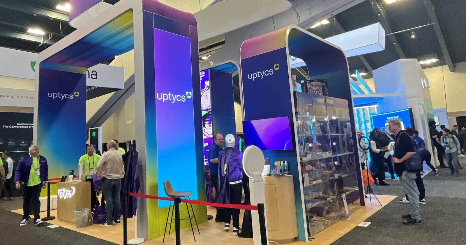
This was a fun booth and it didn’t matter how many times you walked by, there was always a lot of energy going on. Their colors were phenomenal and we really liked the experience. They partnered with a local memorabilia shop as part of their giveaway strategy, which included a
spin to win game. Attendees were given one free spin which drew visitors in. Everybody got a spin plus they were given opportunities to earn more spins. You could earn one more spin if you did the demo. You could also get another spin if you sat through a meeting. So basically you got as many chances to win as you wanted. They were very engaging and easy to talk to, were giving out stickers, and had a lot of fun stuff going on that spoke to their engineering audience. And this became our go-to place for giveaway hot dogs!
Dynatrace
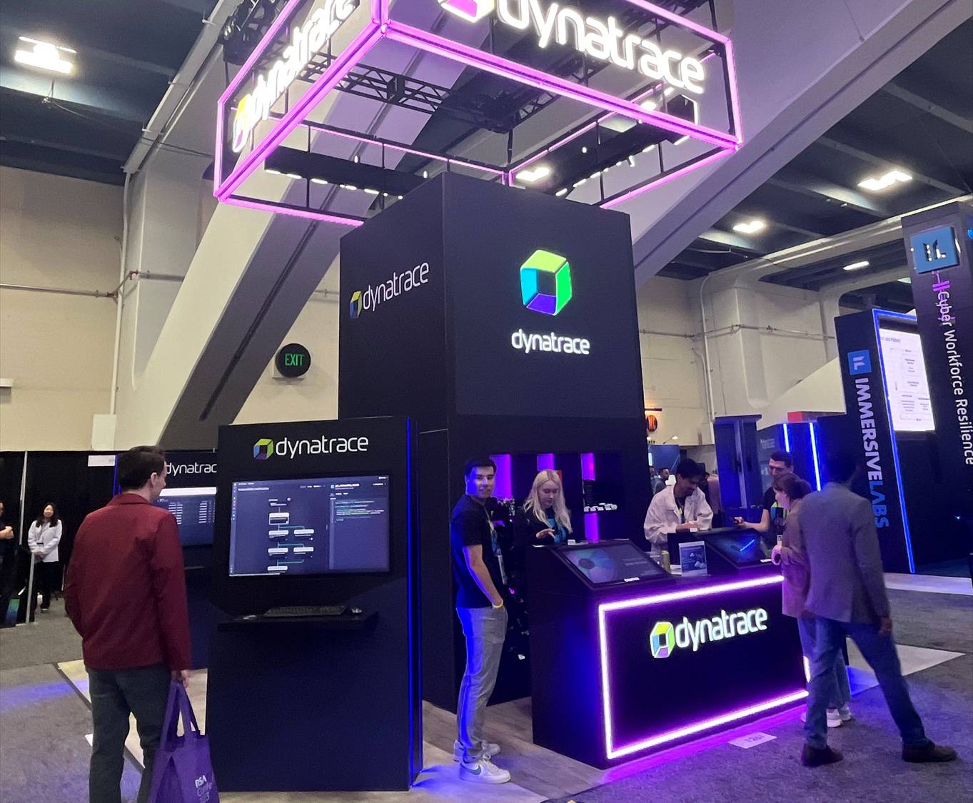
This booth took lighting and LED to the next level. Their sign in the air was beautiful and glowed from all over, even down to the reception desk. We liked the black with their colors; it really worked. They featured Dynatrace LED lighting on the sides of the demo stations that was just really nice looking.
Lumen
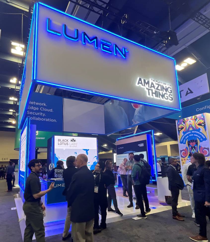
Lumen did a fantastic job of utilizing light, with a blue glow everywhere. You can see they used LEDs around all the demo stations and the reception counter. What you don’t see are the statistics that show people are starting to understand what works; that you need to take it to the next level and have some hard and true numbers in terms of messaging. Telling attendees clearly how you help them will always drive more and qualified traffic into your space. We love that signs at shows are getting taller and taller.
HUMAN
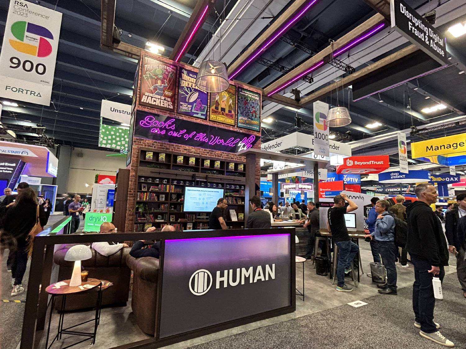
This was probably our favorite on the show floor for their overall experience, attention to detail, and references to their origin. Their backstory is that the company was founded in the back of a sci-fi bookstore and their exhibit paid homage to that. The comic book posters were designed by their agency to fit that theme, with every detail really thought out. It was really cool and super comfortable which made people want to spend time there. There was lots of detail there that made this booth pop!
Lookout
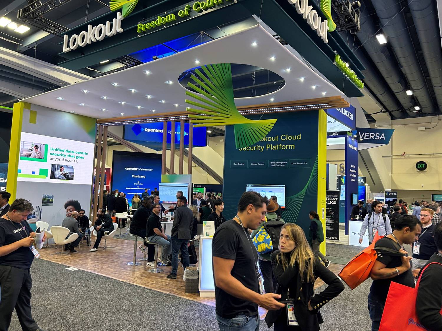
Lookout’s booth was really eye-catching, with different forms and lots of 3D letters up top and a canopy over the head. It wasn’t super complex, but it caught our eyes and you could see it from everywhere. Switching from channel lit to 3D letters is one way to reduce costs.
Axonius
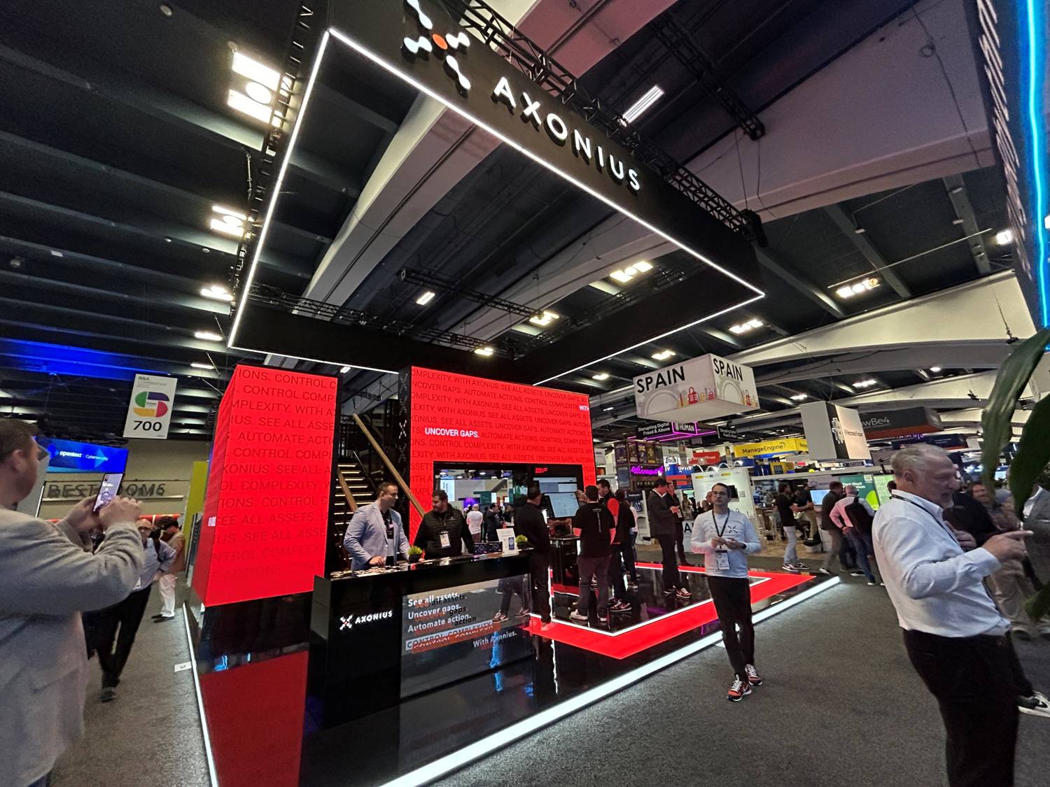
This booth evolves every year. They featured one giant LED and their lighting began on the flooring of the right side and shot up through the entire booth. No matter what the theme of the show was, the lighting and screen changed automatically and we really liked the sort of mini club on the floor.
Noname
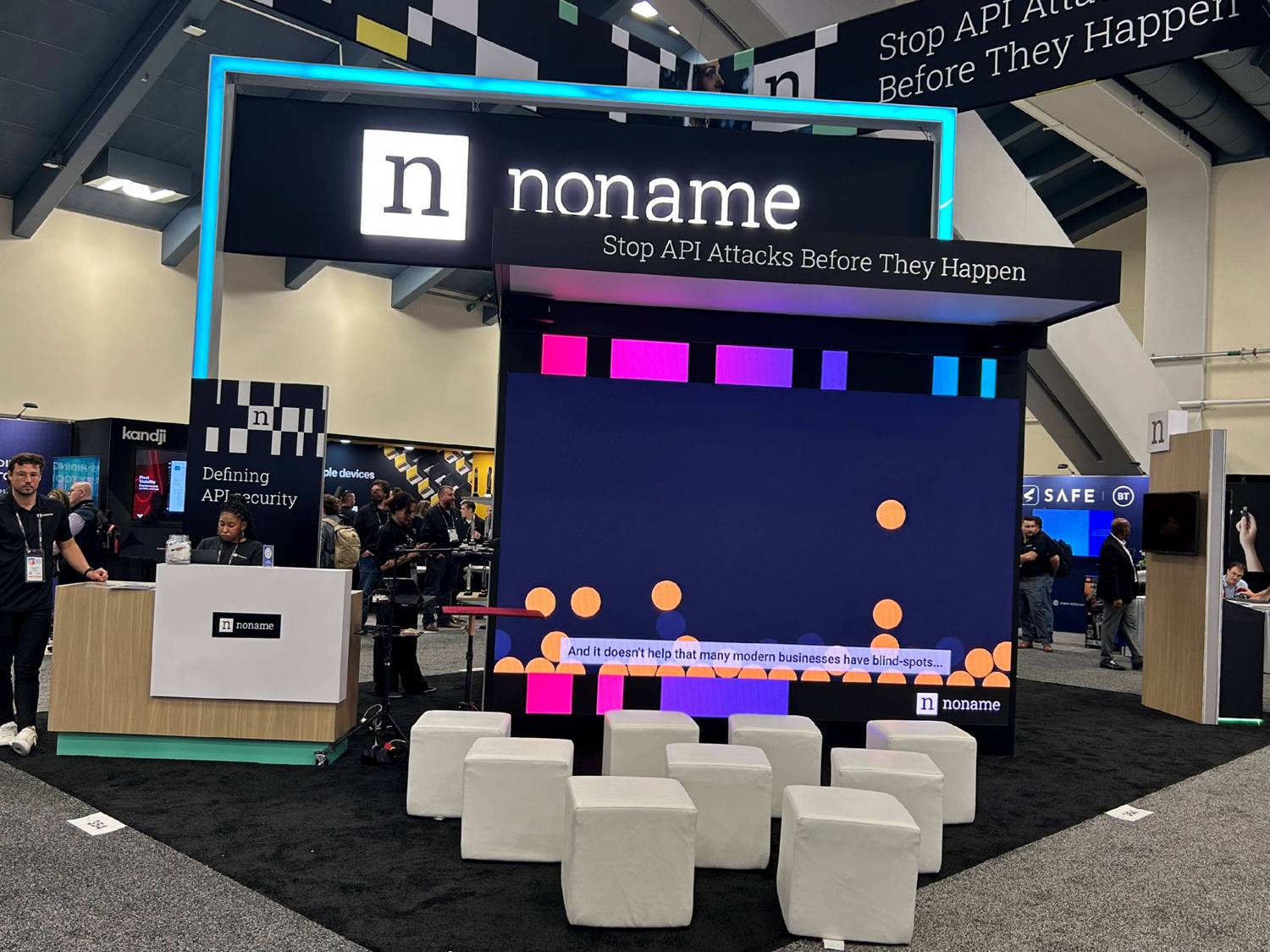
We love the name of this company and are sure their SEO is off the charts! We like the structure, the sign, the lighting, the glowing accent pieces, and simple setup. The trend in lensed lighting, glowing accent pieces, and simple setups goes a long way.
Rubrik
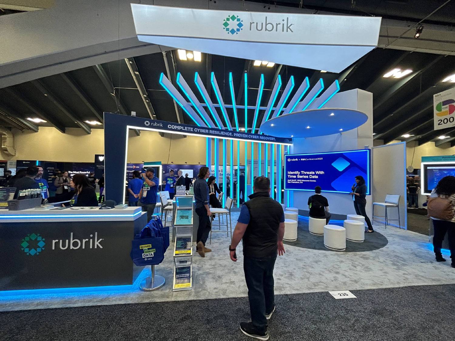
Rubrik did a great job and we really liked the lighting, the interesting structure in the air, and their use of a slot wall. Plus, they had great flow through the booth.
Wiz
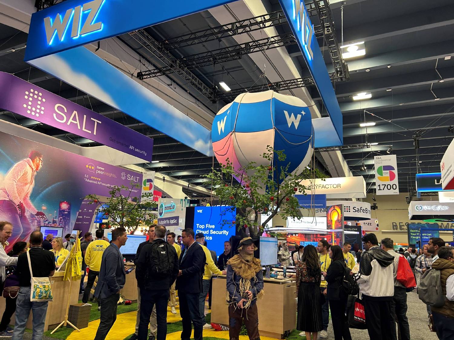
You want to talk about theme? Wiz played on their name with every character from the Wizard of Oz working there and even featured a yellow brick road. Their hanging sign reflected the lighting and people around them plus a club with a DJ above everything else. They are an
example of companies doing ancillary projects all around the venue because they don’t have enough room on the show floor. Wiz had characters up top taking pictures and promoting the company and even bought out an entire restaurant.
Experiences
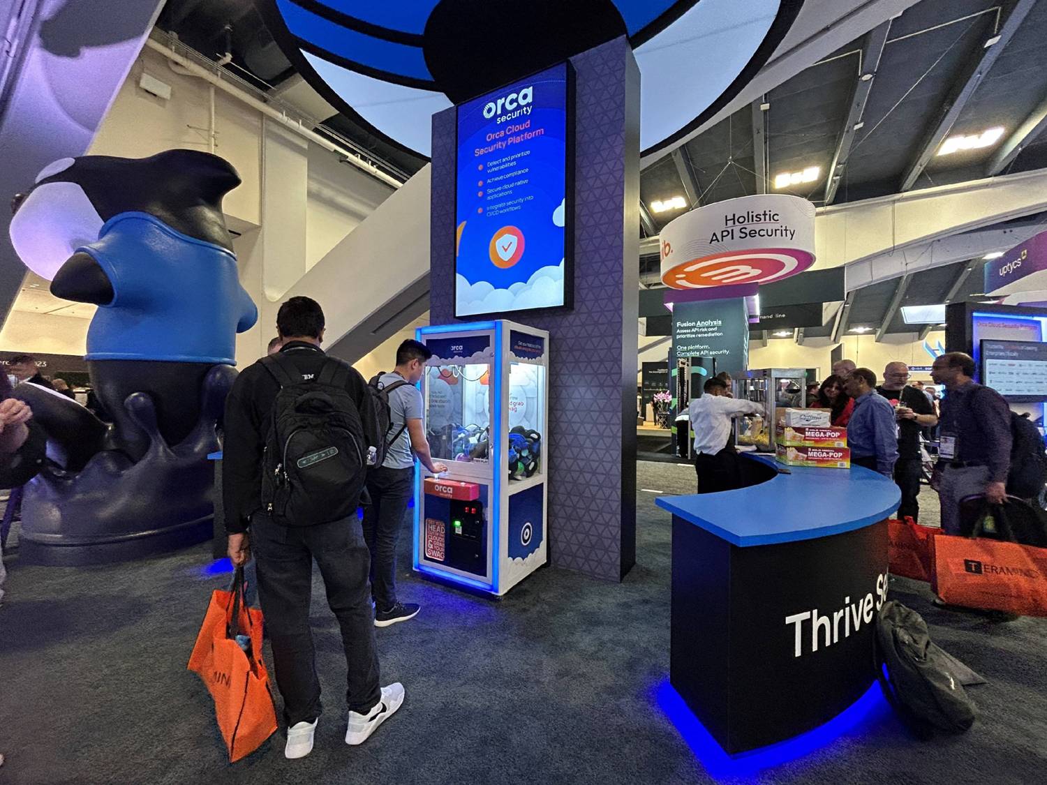
Claw machines, claw machines, and more claw machines! 2023 was the year of claw machines at RSA. Orca had the first of many, with Harness, Snyk, Keeper, and Varonis joining in. Caricatures are always popular, and there was a constant line of people trying to get them
done. One special ancillary event was a 5K run on the Golden Gate Bridge by Illumio. This had a lot of participation with the proceeds going to charity.
While experiences such as claw machines and other forms of gamification attract a lot of attention, they can be a missed opportunity if they don’t somehow tie into your brand messaging and priorities. You’re looking for a great way to differentiate – to do something that ties into your brand message and priorities while drawing attendees and keeping them in the booth.
So ask yourself: what areas of your services need help the most? What objectives can you support through those experiences? And can you use your experience to qualify – or even disqualify – an attendee so your sales team receives clean leads?
Visitors love experiences almost as much as food. Take advantage of that interest with a game or other activity that engages your target audience, ties in directly with your offering, and helps move them through your show funnel. Your sales team will thank you for it!
