This year’s ADLM Conference in Anaheim, CA, drew more than 20,000 visitors and featured 900+ exhibitors. If the name is unfamiliar, it’s probably because you know it as AACC, the global scientific and medical professional organization for laboratory medical professionals. As of the conference, the organization now operates as The Association for Diagnostics & Laboratory Medicine (ADLM.)
So with the new brand activated, let’s take a look at some of our favorite booths at the conference.
Seegene
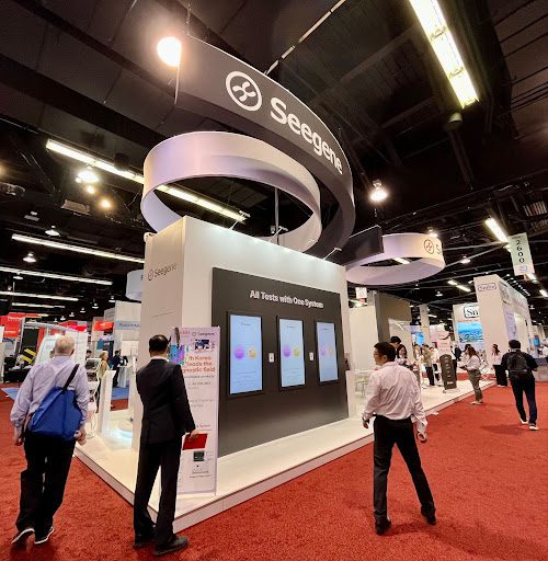
Seegene was an immediate standout at the show with a HUGE LED screen attracting attention. Unless you’re a Roche or an Abbott-level exhibitor, we don’t often see companies bringing this kind of presence to the show.
They also used gamification to engage their attendees. We’re huge fans of interesting ways to engage attendees. It gave Seegene a great opportunity to ask qualifying questions, giving the sales team something to act on immediately. And we know it was popular from the line we saw every time we passed the booth.
Sysmex

Sysmex did a great job with the attendee flow. By using clearly defined spaces, it was easy for attendees to see where they wanted to go. They also had massive graphic opportunities to tell their story.
Bio-Rad
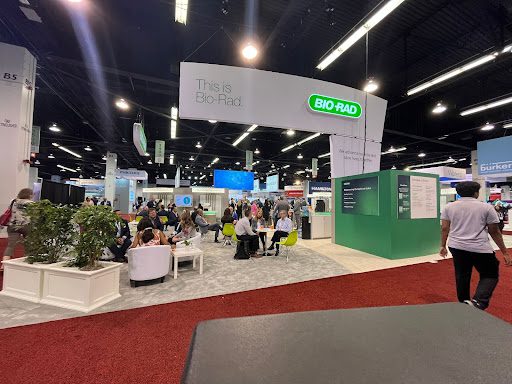
Bio-Rad has been making small changes to their booth every year. This year they featured this big hanging light box. There was also a fabric structural piece that provided some needed lighting for their space.
Bio-Rad brought in some functional creativity that often goes overlooked. They needed extra meeting space and were surprised to learn that the show ran out of the pre-fab meeting space in the back of the hall. Instead, they used a space across from their existing booth to create a meeting room as close as can be.
The room even had some flare with chandelier lights which made it more welcoming (and formal which our own Tami Draper absolutely LOVES.)
Revvity
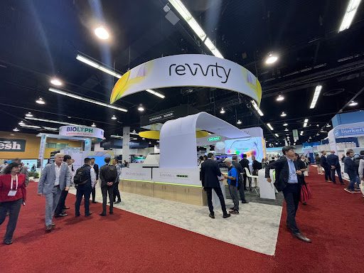
Revvity’s brand colors really made their space pop! But what we really liked was the way their booth design played off the curves in their name. They had a curved up-and-over structure with lighting that welcomed attendees, and a curved reception desk with great lighting throughout. They also had an LED wall that really stood out.
We’ve talked about the trend of natural wood, which they used well, and more and more we are seeing a move away from high-boy tables and instead using more functional up-and-over tables. Revvity used a mix of both.
The booth closed out with these beautiful, crisp, light box graphics. An overall great presence on the floor.
Randox

One of our favorite booths was Randox! Maybe it’s us, but we love symmetry. It makes the space easy to navigate and it was all contained under the white box hanging over their space.
Randox invested quite a bit to draw attendees to their space with the use of hanging elements including a big hanging LED in front. On the backside of their booth, they had a small storage room for their staff with IKEA-style lockers. An underrated element of any booth, bringing solid organization to the storage room.
Cepheid
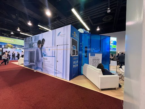
Cepheid’s booth used a vibrant and colorful plexi to draw people into the archway. Once inside, the archway led to an experiential space for attendees to dive deeper into the space.
Werfen
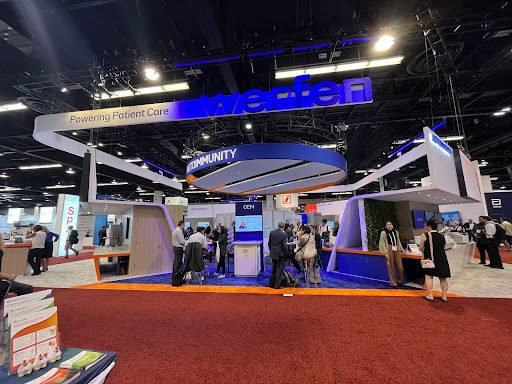
We’ve talked some about the different flooring choices that we are seeing in shows now, and Werfen is a good example of using unique flooring inlays to break up the space.
Biomerieux
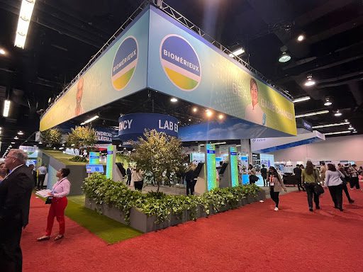
Here’s an example of a large space with lots of potential – and we’ve got suggestions on how to make it better! But we’ll talk about that in a minute.
We love the use of natural elements like faux rocks and plants. Especially at a medical show, it’s a clear way to stand out and make people feel at ease. The huge hanging sign made the space hard to miss, but their name was sort of secondary. In all, it seemed like they spent a lot of money in the air that might have been more effective elsewhere.
We try to avoid sharing negative feedback without knowing more about a company’s objectives, but we’re going out on a limb this time. Here are a few suggestions to make a better impact while saving some money:
- Rig less – although the signs gave great visibility to defined spaces, they could have been built with floor-supported structures.
- Increase the size of the company name. If you don’t want that, at least use the rest of the space to say something that will draw in your ICP to the space.
- Shrink the font on the secondary hanging signs. It felt impossible to see what each of these signs said which makes the additional rigging an even bigger waste of the budget.
Regardless of the size of the show, EDE helps your booth to hit all the high notes. Contact MenasheJ@edecorp.com to discuss how we can help.

